MaxxGo - A modern Revamp
MaxxGo is a mobile forex trading platform built without design input. My goal was to give it a modern and easy-to-use interface and improve usability by fixing UX issues. Also, we focused on white-labeling it for clients.
Project Background:
MaxxGo’s old mobile design had many usability problems and lacked a consistent style, making it difficult for traders to use. The client needed a quick redesign to make the app clearer, more modern, and user friendly.
Time Line:
September 2024 - Present
The Problem
The old MaxxGo mobile app had an outdated design that confused users and made tasks harder for traders. Key issues included:
Inconsistent and unclear components
Difficult navigation and poor usability
No design system or proper documentation
Tight timeline to meet client demands
Goal
To create a modern, user-friendly design that makes trading easier and faster for users. The focus was on:
Fixing usability problems
Creating a consistent design system
Providing clear wireframes for development
Making the app scalable for client branding in the future
Design Process
Understanding users
UX Audit
I did a UX Audit on the platform and identified key usability issues impacting user experience.
Issues identified: Inconsistent Component Usage, Poor Visual Hierarchy, Cluttered Layout, Navigation Issues
Usability Testing
Conducted usability testing with a few real traders to validate these issues.
Action Taken: I observed how users interacted with the UI to complete tasks, noted down pain points, and asked feedback questions about their experience while using it.
Sample screens that lacked visual consistency
Analysing User Needs
Conducted sessions with stakeholders, including the sales head and product owners to prioritize what is needed for fixing and to understand the primary goals of the redesign.
Aimed to Improve usability, make navigation easier, and have a clean, consistent design easy for users to understand and use. Also to produce design documents that could be useful in the future.
Main Issues with MaxxGo
Inconsistent Styles - buttons and elements look different in specs
Too Cluttered - screens are crowded with info, making it hard for users to focus
No Clear Order - Visual hierarchy is off and not arranged well
Hard to Navigate - users struggle to find where they are or to switch sections
Missing validation - no clear validations to show error mistakes
Missing labels - Headings on every page are missing
Bad Use of Color - colors don’t highlight important actions or alerts
Small Texts and Buttons - texts and buttons are too small which causes users usability issues
What Users Need
Keep it Simple - Clean & easy to read layout
Make it Clear - have a consistent design
Clear Hierarchy - Arrange data based on importance
Easy to Read - Space out contents for easy reading
Sample UI/UX issues spotted
Exploring Solutions
Sketch ideas
To visualize my ideas, I sketched each screen one by one on my iPad.
Used a mockup app to try out different layouts and design structures to fix the main issues we identified.
This process helped me explore and refine new design ideas. I tried simplifying the visual hierarchy and organized the layout to make it easy for users to find what they need
Sample sketches of the main screens
Styles & Design system
I created a design system with consistent colors, fonts, and components to make MaxxGo easy to use and adapt for different clients. This helped build a clean, user-friendly foundation for the app.
Sample Figma variables & Components
Sample Design System
Test & Result
Old Login Screen
I transformed the old UI into a modern one fixing major UX issues. Light & dark themed versions were developed. The UI screens were prototyped & tested with traders to find usability issues.
Refined the wireframes based on the observations & feedback.
Development hasn’t started yet, as we are still working on wireframes for white-label clients. Development for the generic version will begin in a few weeks.
New Login Screen
Old MW Screen
New MW Screen
Wireframe Organization
The wireframes are arranged on separate pages for a clear and organized structure. Once finalized, they will be compiled on a single page after review.
Sample Organized Wireframe Pages
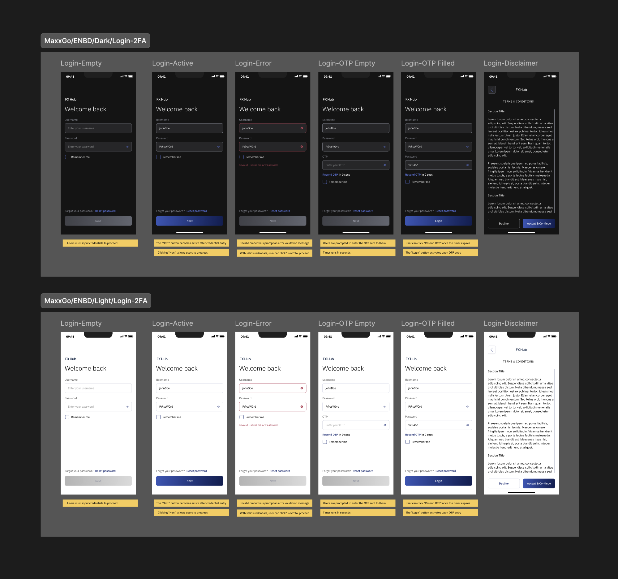
White-Labeled Login Page Preview
EIB
Old Trade Screen
ENBD
New Trade Screen
White-Labeled Wireframes
While white-labeling, we gathered each client’s preferences for colors and specific style elements, like color schemes and logos. This allowed us to apply each client’s branding to MaxxGo, ensuring it aligned with their brand identity while keeping a consistent layout.
Challenges & Take aways
Challenges faced
- Lack of design documentation made me work on everything from scratch
- Delayed user interviews with overseas clients due to differences in time zones
- Managing multiple clients at the same time was challenging
- White-labelling with client’s preferences caused readability and accessibility issues - had to explain to them about the design choices
Learnings
- Testing with real users helped me catch unexpected issues
- Understanding user pain points helped me brainstorm practical solutions
- Frequent review & feedback sessions improved my skills and expanded my knowledge, helping me refine the design through each iteration


